
The uneven recovery of nursing-home census
Nursing home occupancy nationally is 80.4%, almost exactly where it was before the pandemic. It is steady because the sector lost 70,000 certified beds: a smaller bed count filled at the same rate. Census is still 5% below 2020. Urban homes are back to their pre-pandemic census. Rural homes are four points below it, and rural occupancy has dropped more than five times as far as urban.
Objective
National figures are the benchmark most decisions are measured against, and they are the wrong one for almost all of them. A building four points below the national index may be performing at or above its own county. A building matching it may be losing ground in a market that has fully recovered. This study takes the same CMS data those figures come from and separates it by region, community type, facility type and facility size.
Regional variation
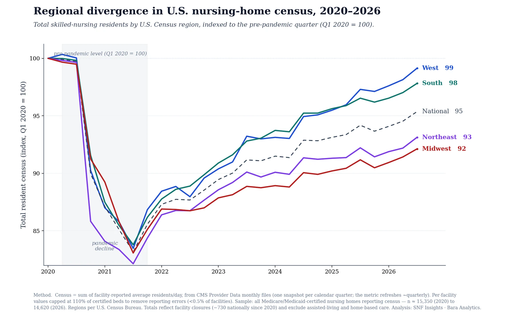
Indexed to pre-pandemic, the four census regions fan apart. All four fell by about 16% to the 2021 trough. What happened afterwards was not the same at all: the West is nearly back at 99, the South is at 98, while the Northeast sits at 93 and the Midwest at 92.
The urban-rural gradient
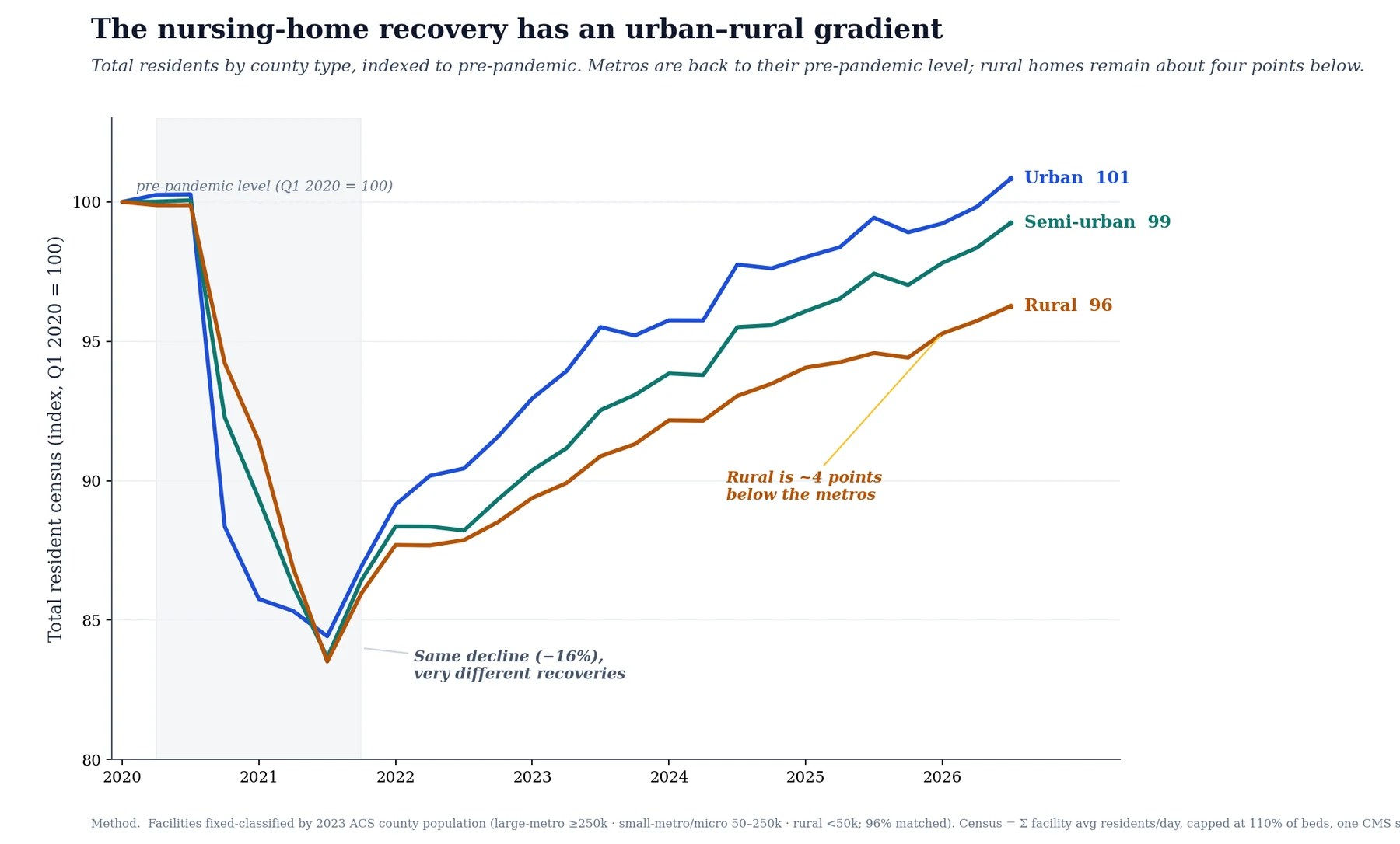
Sort every facility by the population of the county it sits in and the recovery separates into three lines that have not converged since. Large-metro homes are slightly above their pre-pandemic census at 101. Rural homes sit at 96, and have been about four points behind for two years.
The obvious explanation is that rural homes closed. They did not. Closure rates are almost identical across the three tiers. Decomposing the change into existing homes, facilities newly certified, and facilities leaving the panel shows something less comfortable:
| County type | Existing homes | Newly certified | Exits |
|---|---|---|---|
| Large metro | −1.9% | +1.3% | −0.2% |
| Small metro | −3.3% | +1.5% | −0.1% |
| Rural | −5.3% | +0.9% | −0.2% |
The difference between the tiers sits in the first two columns, not the third. In metro counties newly certified facilities added back most of what existing homes lost. In rural counties existing homes lost nearly three times as much and new certifications added back less. Rural counties moved against them on both of those terms. The closure column is near-identical across the three tiers, so whatever separates them, it is not that more rural homes shut.
What this cannot tell you is why the buildings went up where they did. The decomposition is an accounting identity, not a mechanism: same-store plus openings minus closures equals the net change by construction, whatever the reasoning of whoever built. Whether metro development responded to residents leaving existing homes, or to land, labor, payer mix or capital availability, is outside this data.
Nor can we say these are new buildings. What is observable is certification, not construction. Of the 303 facilities that entered the panel over the window, 95% hold a first Medicare approval date inside it, which rules out re-entry of a previously certified provider. It does not separate a newly built facility from an existing building newly participating in Medicare, and this data contains nothing that would. The column is labelled newly certified for that reason.
Robustness: state composition
This is the finding we stress-tested hardest, because a gradient this clean is often two or three states driving an average. This one is not. Rural trails metro in 27 of the 35 states with meaningful census in both tiers. Remove the three worst and the gap narrows from 4.0 points to 3.3. Remove the five worst, 3.0. Remove the ten worst and rural still trails by 2.2 points. No small group of states accounts for it.
Robustness: facility type
Rural nursing homes are not a random sample of nursing homes. They are twice as likely to sit inside a hospital (6.2% against 3.3%), more than twice as likely to be government-owned (11.0% against 4.7%), and much less likely to be part of a continuing care retirement community (6.8% against 11.9%) or to be Medicare-only (0.5% against 4.9%). Any of those could be the real driver. A hospital swing-bed unit and a 240-bed suburban facility are different businesses.
So we removed them, one at a time and then all together:
| Facilities included | Urban | Rural | Gap | Count |
|---|---|---|---|---|
| All (as published) | 100.1 | 96.3 | +3.8 | 14,727 |
| Excluding CCRCs | 100.7 | 96.6 | +4.0 | 13,177 |
| Excluding hospital-based units | 100.1 | 96.3 | +3.8 | 14,130 |
| Excluding government-owned | 100.4 | 96.7 | +3.7 | 13,783 |
| Excluding Medicare-only | 100.0 | 96.2 | +3.8 | 14,180 |
| Excluding under 30 beds | 100.2 | 96.3 | +3.9 | 14,375 |
| Excluding all five at once | 100.8 | 97.3 | +3.6 | 11,564 |
Dropping all five simultaneously removes 3,163 facilities, more than a fifth of the panel, and the gap moves from 3.8 points to 3.6. The gradient survives all of them. Free-standing, privately owned, dually certified nursing homes of ordinary size show it just as clearly as the full panel does.
Robustness: facility size
Rural homes really are smaller: a median of 81 certified beds against 108 in urban counties. Rural facilities are 40% of every home under 60 beds and only 10% of those with 150 or more. If small facilities recovered worse, “rural” could be standing in for “small” throughout this study.
Small facilities did recover worse. So did the largest ones:
| Certified beds | Facilities | Census index | Occupancy then | Occupancy now | Beds |
|---|---|---|---|---|---|
| Under 60 | 2,692 | 97.3 | 81.5% | 83.1% | −4.6% |
| 60 to 99 | 4,628 | 100.8 | 81.0% | 81.8% | −0.3% |
| 100 to 149 | 5,016 | 100.4 | 80.6% | 79.8% | +1.5% |
| 150 or more | 2,387 | 97.3 | 82.0% | 79.5% | +0.4% |
The pattern is an arch, not a slope. Both ends of the size range sit at 97 while the middle is back above 100, so there is no simple “bigger is better” effect for rural to be hiding behind. The occupancy columns say why the two ends got there differently. Small homes cut 4.6% of their beds and their occupancy rose to 83.1%, the highest of any band. The largest homes added beds and their occupancy fell 2.5 points to 79.5%. The two ends of the size range have different problems.
And the urban-rural gap holds inside every band:
| Certified beds | Urban | Rural | Gap | Rural share of band |
|---|---|---|---|---|
| Under 60 | 99.5 | 94.1 | +5.4 | 40% |
| 60 to 99 | 101.9 | 98.5 | +3.3 | 35% |
| 100 to 149 | 101.7 | 95.6 | +6.1 | 22% |
| 150 or more | 97.5 | 94.1 | +3.4 | 10% |
A rural home trails an urban home of the same size in all four bands, by between 3.3 and 6.1 points, and the gap is widest in the 100-to-149 band where rural facilities are only a fifth of the total. A 120-bed nursing home recovers differently depending on the county it sits in. This holds the business model roughly constant and varies only geography.
Divergence and statewide decline
This distinction changes what you would do with the finding. Map each state by its urban-minus-rural gap rather than by its rural level, and two phenomena that a rural-only map treats as one pull apart:
- True divergence. Metros rebounded to or above par while rural fell behind. Arizona +21 (urban 108, rural 87), North Dakota +14, Colorado +11, Michigan +8, Iowa +7.
- Whole-state decline. Both tiers fell together. Wisconsin +1 (urban 86, rural 85), Minnesota +0, Pennsylvania −0.
Wisconsin and Minnesota look like the worst rural states in the country on a conventional map. They are not. Their metros fell just as far. Their rural decline is not rural-specific at all. It is a state-level story about Medicaid rates, workforce and bed supply, and the rural-only map gets that conclusion exactly wrong.
Plotting both dimensions at once, how far a state's census has recovered against how far its two tiers have separated, puts every state in one of four quadrants and separates the two clearly.
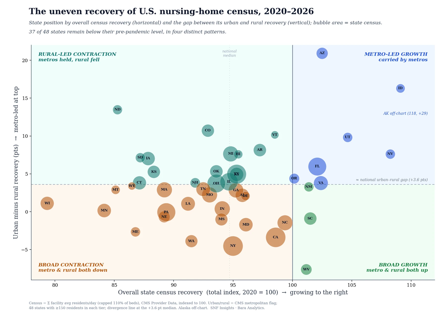
Among the 37 states still below pre-pandemic, the split is 25 states in whole-state decline against 12 with rural-specific drag. Of the 11 that grew, seven did it on their metros alone. Only four grew across both tiers.
Demographic change
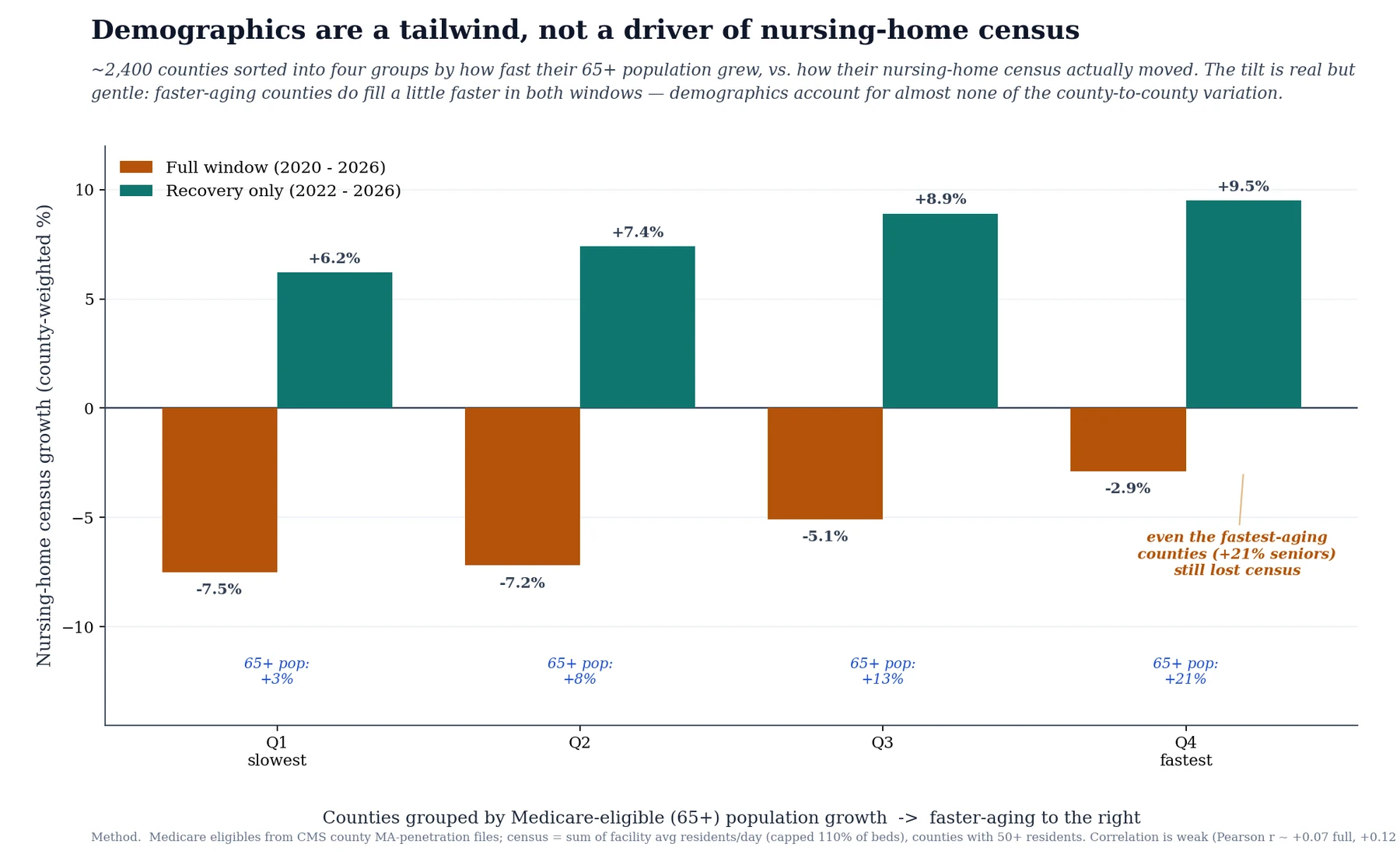
The intuitive explanation is that some places are aging faster than others. It does not survive the test. Sorting roughly 2,400 counties into quartiles by growth in the Medicare-eligible population:
| County quartile | 65+ growth | Census, full window | Census, recovery only |
|---|---|---|---|
| Slowest-aging quarter | +3% | −7.5% | +6.2% |
| Fastest-aging quarter | +21% | −2.9% | +9.5% |
The tilt is real and it runs the right way, but it is weak. A correlation of about +0.07 across the full window, which is roughly 1% of the variation between counties. The second column is the point: even the fastest-aging counties, with 21% more seniors, still lost census. Aging does not account for the differences between counties in this window. One likely reason is that most of the growth in the 65-and-over count sits at the younger end of it, well below the age at which people enter nursing homes, but this study does not measure age within that population and cannot test that.
Decomposition: demand and supply
Decomposing the national change shows where it went. Over the past year existing homes filled by 1.5%, which is real, broad-based demand recovery. Net closures took about a third of that back off, leaving +1.3%. Over the full window since 2020 the shortfall splits almost exactly in half: existing homes −2.8%, net closures −2.7%.
Occupancy, nationally
Counting residents asks how many people are in nursing homes. Occupancy asks how full the nursing homes are. They are different questions and, nationally, they now give opposite impressions:
| Pre-pandemic | Latest | Change | |
|---|---|---|---|
| Residents | 1,318,308 | 1,257,244 | −4.6% |
| Certified beds | 1,633,807 | 1,563,603 | −4.3% |
| Occupancy | 80.7% | 80.4% | −0.3 pts |
The bed base shrank by almost exactly as much as the resident count did, so occupancy is effectively back to where it started. Three tenths of a point is within noise. An operator asking “has occupancy come back?” gets a different answer from the census number, and both answers are true, because they are answers to different questions.
This is also the cleanest available statement of the supply finding. Census cannot fall 4.6% while occupancy holds unless capacity left at the same rate. It did: 70,000 certified beds, gone.
Occupancy by geography
Split by geography, that reassurance does not hold:
| Occupancy then | Occupancy now | Change | Beds | |
|---|---|---|---|---|
| Urban | 82.4% | 82.0% | −0.4 pts | +0.6% |
| Rural | 77.0% | 74.8% | −2.2 pts | −0.9% |
Urban homes are as full as they were. Rural homes lost more than two points of occupancy while barely reducing their bed count. Rural nursing homes have roughly the bed count they had before. Fewer of those beds are occupied. They started five points below urban occupancy and are now seven points below. Whatever national occupancy says about the sector, the gap it hides is wider than the census gap, not narrower.
Put the national figures together and the pattern is consistent. Demand is recovering: existing homes filled by 1.5% over the past year, and occupancy is back to 80.4% against 80.7% before the pandemic. Supply is what is shrinking, by 70,000 certified beds. The three largest contracting states show the same signature. Wisconsin and Minnesota each removed 14 to 15% of their beds, three times the national rate, while their populations over 65 grew faster than the nation's. The older population has grown. The bed count has not.
Definitions
| Census | The sum of each facility's reported average residents per day. A count of people, not of beds. |
| Occupancy | Census divided by certified beds. Moves when either one changes, so it is independent of census. |
| Census index | A census series rebased to 100 at its own pre-pandemic value. An index of 96 means that group has 4% fewer residents than it had, not 4% below any other group. |
| Gap | Urban index minus rural index, in index points, whatever level either reached. |
| Same-store | Facilities reporting in both periods of a comparison. Entry and exit are excluded, so the change reads as demand. |
| Newly certified | In the panel at the end but not the start, first approved inside the period. Certification, not construction: it may be a new building or an existing one newly in Medicare. |
| Exit | Present at the start, absent at the end. Includes closures, terminations and certification changes, which this data does not separate. |
| Urban and rural | In a metropolitan county or not, by the CMS flag. The three-tier gradient uses county population instead: 250k and above, 50 to 250k, below 50k. |
| Certified beds | Beds certified for Medicare or Medicaid, and the occupancy denominator. Neither licensed beds nor beds in service. |
| Hospital-based, CCRC, Medicare-only | CMS facility flags: a unit inside a hospital, part of a continuing care retirement community, certified for Medicare but not Medicaid. |
Limitations
| Self-reported, unaudited | Compiled from facility submissions and not audited for this purpose. Across 405,853 facility-quarters, 0.5% carry no usable census and 1.2% report more residents than certified beds, which is impossible. Bed counts include 1 against more than 100 residents. CMS revises and republishes; each snapshot is read as published. Nothing is dropped or imputed, so these errors sit in the totals, bounded by the figures given. |
| Census is not occupancy | Eight of the 23 contracting states cut beds while occupancy held or rose; California reached 88.1%. The urban-rural result holds on both measures. Individual states do not. |
| Two-quarter reporting lag | The 2020 decline appears at the Q4 2020 snapshot. Magnitudes are measured correctly; timing is not. |
| Entry and exit are panel events | A facility appearing or disappearing, not a building opening or closing. Net change is unaffected either way, as ownership transfers appear on both sides. |
| Facility mix is tested, not controlled | Type and size were removed by exclusion, not modeled jointly with state, ownership and payer mix. Attribution would require that. |
| Nursing homes only | Assisted living, home health and independent living are out of scope and may absorb displaced demand. |
| No causal claim | Medicaid rates, direct-care wages and state moratorium policy are not in this data. |
Method
| Source | CMS Provider Data (Care Compare), monthly snapshots |
| Period | Pre-pandemic 2020 to Q3 2026, 27 quarters |
| Panel | About 14,700 certified nursing homes; last snapshot in each calendar quarter |
| Census | Sum of average residents per day, capped at 110% of certified beds |
| Index | Each series set to 100 at its own pre-pandemic value |
| Cap | Binds on 0.43% of rows. The national index is 95.37 uncapped, 95.37 at 110% and 95.38 at 100%, so it is a guard rather than a lever. The extreme ratios are bad bed counts, which matters more for occupancy than for census. |
| Baseline | A single pre-pandemic snapshot. A trailing four-quarter blend moves the national gradient by under 0.2 points; a few small state-tiers move up to 4% on 2019 bed-supply changes. |
| Urbanicity | Fixed once per facility from its latest snapshot, since the CMS flag is populated only in recent files. County population tiers (2023 ACS, 96% join) give a 4.0-point gap; the CMS flag gives 3.8. |
| Same-store | Matched by CMS certification number. Same-store plus entry minus exit equals net change by construction. |
Robustness of the urban-rural gap
| Test | Result |
|---|---|
| Remove worst rural states | 4.0 to 2.2 points at ten removed; never reverses |
| Exclude facility types | 3.6 to 4.0 points |
| Within bed-size bands | 3.3 to 6.1 points |
| Change baseline | Under 0.2 points |
| Switch metric to occupancy | Gap widens; rural occupancy falls further in 36 of 48 states |
Further work
This establishes a pattern and rules out four explanations for it. It does not identify a cause, and the variables most likely to carry one are not in CMS Provider Data. In the order we would work through them:
| Home and community-based services | 1915(c) waiver expansion and ARPA funding move long-stay residents into the community, lowering census without any change in demand for care. Testable against CMS 372 reports and state expenditure data. |
| Level-of-care criteria | States set the functional threshold for nursing-facility eligibility. Changes are documented and dated per state, so this is a natural difference-in-differences. |
| Managed Medicaid long-term care | These plans carry an explicit mandate to keep members in the community. Penetration varies by state and is already in our data, making this the cheapest to test. |
| Home health and hospice supply | Agency density per capita and its change since 2020, to see whether displaced demand went somewhere measurable. Cost reports are loaded. |
| Medicare Advantage penetration | These plans shorten skilled stays and divert rehabilitation to home health. Penetration runs 55 to 58% in the three largest contracting states against 52% nationally. |
| Medicaid rate adequacy | Per-diem against facility cost, from Medicare cost reports. The direct test of whether bed closures track financial viability. |
| Direct-care workforce | Wages and turnover against local labor markets. Payroll data is quarterly, so this can be tested per facility rather than per state. |
| Assisted living supply | The substitution everyone assumes and nobody measures, since there is no federal registry. Would require assembling state licensure files. |
Two design changes would strengthen what is here. A single specification regressing facility-level census change on urbanicity, size, type, ownership and state fixed effects would convert the exclusion tests into an estimate of how much of the gap urbanicity itself carries. And replicating every state-level result on occupancy would resolve the handful of states where the two measures disagree.